Some More Common Commands
…or rather functions
- grep()
- gsub()
- apply() & Co.
- length()
- rev()
More Commands – grep
grep(): a function that searches for patterns in a given "character" vector.
Example:
							# Search for "GC" in a set of primer sequences

							> seq <- c("GTGGGGCATTTACGTGGCT", "AATTAAACATGTAG",
								"GCGCAAATAGTCT", "AAAGACAGTGATGACCC")
							> grep("GC", seq, perl = TRUE, value = FALSE)

							[1] 1 3
More Commands – grep
If the argument value = FALSE or value is unspecified, grep() will return the indices of matching elements not the elements themselves.
With value = TRUE it will show the elements.
							# Showing elements now...
							> grep("GC", seq, perl = TRUE, value = TRUE)

							[1] "GTGGGGCATTTACGTGGCT" "GCGCAAATAGTCT"
Regular Expressions
- .: an arbitrary character
- [a-z] one character from a certain group
- .+: at least one of the preceding character(group)
- .*: none, one or several characters of the preceding
- [atgc]{2,4} two to four DNA bases (as an example)
Welche(s) Muster findet atg[tc]{3,9}.*a+?
More Commands – sub
sub() Like grep() this function will look for matching pattern in a character vector's elements. Those will be replaced by the second argument. (First hit per element only.)
							> sub("GC", "GT", seq, perl = TRUE)

							[1] "GTGGGGTATTTACGTGGCT" "AATTAAACATGTAG" "GTGCAAATAGTCT"
							[4] "AAAGACAGTGATGACCC"
gsub() in contrast to sub() this will replace all occurences per element.
							> gsub("GC", "GT", seq, perl = TRUE)

							[1] "GTGGGGTATTTACGTGGTT" "AATTAAACATGTAG" "GTGTAAATAGTCT" "AAAGACAGTGATGACCC"
Function based loops – apply
apply() will apply a given function on all elements of an argument matrix, vector or array. It's the R-ish way of relying on vectorized functions instead of traditional loops.
Generalized form:
apply(X, MARGIN, FUN, ...)
- with X Array or Matrix
- MARGIN dimension to use; in a matrix 1 means rows ("y"), 2 columns ("x").
- FUN name of function to apply
Example: Define a matrix and get the highest values per column:
							> X <- matrix(c(2, 10, 8, 5, 18, 7,
								9, 4, 17), nrow = 3)

							> apply(X, 2, max)
							[1] 10 18 17
Function based loops – lapply
lapply() apply a function to list elements (or dataframe, or vector). Will return a result list of equal length.
Generalized form:
lapply(X, FUN, ...)
Function based loops – lapply
E.g.: Generate a dataframe Wwith expression values for a couple of genes (MEDEA, FIS, FIE, PHE, MEI) in to replicates (rep1 und rep2):
							# data.frame with gene names and expression values
							> data <- data.frame(genes = c("MEDEA", "FIS", "FIE", "PHE", "MEI"),
								 expr_rep1 = c(122, 1028, 10, 458, 77), exprs_rep2 = c(98, 999, 20, 387, 81),
								 stringsAsFactors = FALSE)

							> data
							  genes expr_rep1 exprs_rep2
							1 MEDEA       122         98
							2   FIS      1028        999
							3   FIE        10         20
							4   PHE       458        387
							5   MEI        77         81
Function based loops – lapply
							# get log2 of the values
							> y <- lapply(data[,2:3], log2)

							# Returned result list
							> y

							$expr_rep1
							[1]  6.930737 10.005625  3.321928  8.839204  6.266787

							$exprs_rep2
							[1] 6.614710 9.964341 4.321928 8.596190 6.339850
Function based loops – sapply
With sapply() we get a "simple object" as a result. Here, it's a matrix:
							> z <- sapply(data[, 2:3], log2)
							> z
								 expr_rep1 exprs_rep2
							[1,]  6.930737   6.614710
							[2,] 10.005625   9.964341
							[3,]  3.321928   4.321928
							[4,]  8.839204   8.596190
							[5,]  6.266787   6.339850
Die apply-Family
| Function | Input | Output |
|---|---|---|
| aggregate | dataframe | dataframe |
| apply | array-like | array-like/list |
| by | dataframe | list |
| lapply | e.g. list | list |
| mapply | arrays | array-like/list |
| sapply | e.g. list | array-like |
It's not always easy to pick the right "apply-like function".
More Commands – length
Will return the number of elements in a given argument.
							# e.g. a vector
							> a<-2:11
							> length(a)
							[1] 10
							# e.g. a matrix
							> a<-matrix(1:12,nrow=3) # e.g. matrix
							> a
							     [,1] [,2] [,3] [,4]
							[1,]    1    4    7   10
							[2,]    2    5    8   11
							[3,]    3    6    9   12
							> length(a)
							[1] 12
NB.…
							# e.g. dataframe
							> b<-data.frame(1:2, 2:3)
							> b
							  X1.4 X2.5
							1    1    2
							2    2    3
							> length(b)
							[1] 2
More Commands – rev
Will reverse the order of the elements in an argument.
								# vector
								> a<-1:11
								> a
								 [1]  1  2  3  4  5  6  7  8  9 10 11
								> rev(a)
								 [1] 11 10  9  8  7  6  5  4  3  2  1
								# matrix
								m<-matrix(1:12,nrow=3)
								> m
								     [,1] [,2] [,3] [,4]
								[1,]    1    4    7   10
								[2,]    2    5    8   11
								[3,]    3    6    9   12
								> rev(m)
								 [1] 12 11 10  9  8  7  6  5  4  3  2  1
And…
								# data frame
								> rev(data)
								  exprs_rep2 expr_rep1 genes
								1         98       122 MEDEA
								2        999      1028   FIS
								3         20        10   FIE
								4        387       458   PHE
								5         81        77   MEI
Areas of Statistics
The field of statistics is usually comprised of two areas:- Descriptive Statistics Descriptive Statistics aims at describing, ordering and displaying empirical data by using graphics, tables and characteristic numbers.
- Deductive Statistics Deductive Statistics aims at deducing properties of a population from a random number of samples. It uses mathematical methods for generalizations, estimations and predictions.
Descriptive Statistics
Descriptive Statistics: Summarize, order and describe data.
- graphical – in the following slides
- numerical – later…
Types of Diagrams
- Pie chart
- Bar chart
- Histogram
- Scatterplot
Graphics
Examples for diagrams commonly used to describe data are Boxplots, Pies, Histograms
R implements:
- functions for (not always) simple diagrams from
- special packagesto create graphics, like the "lattice" library
(https://cran.r-project.org/web/packages/lattice/lattice.pdf)
Pie-Chart
A pie chart is used to display fractions of a population as sections of a circle.
The main function is pie()
Generalized form:
> pie(x, labels, radius, main, col, clockwise)
- x: data vector
- labels: descriptions of the pieces
- radius: radius of the pieces from -1 to 1
- main: title of the Chart
- col: color palette
- clockwise: TRUE – clockwise, FALSE – counter-clockwise
Pie example
							# In the following example we will display cultivation
							# statistics for farmer Ernst's land as percentages
							# of the total area

							# Generate data

							> x <- c(5, 10, 7, 3, 4, 68)
							> labels <- c("Zucchini", "Tomaten", "Gurken", "Feldsalat", "Rosenkohl", "Mais")

							# Define file name and format
							> png(file = "Ernsts_field.png")

							# Generate Pie
							> pie(x, labels, clockwise = TRUE)

							# Save graphics file
							> dev.off()
Example Pie
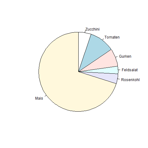
Example Pie
Let's label the chart…
							# Generate data
							> x <- c(5, 10, 7, 3, 4, 68)
							> labels <- c("Zucchini", "Tomaten", "Gurken", "Feldsalat", "Rosenkohl", "Mais")

							# nameing the file
							> png(file = "Ernsts_Acker_neu.png")

							# Generate the chart
							> pie(x, labels, main = "Ernsts Acker", col = rainbow(length(x)))

							# Save graphics
							> dev.off()
Pie Example
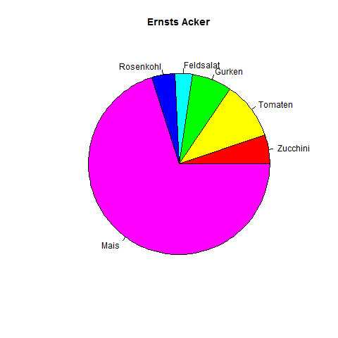
Example Pie
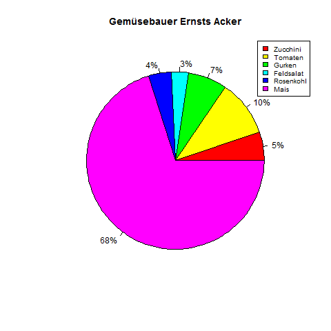
Put percentages onto the pieces and insert a legend
							> x <- c(5, 10, 7, 3, 4, 68)
							> labels <- c("5%", "10%", "7%", "3%", "4%", "68%")
							>
							> png(file = "Ernsts_Acker_Anteile.png")
							>
							> pie(x, labels, main = "Gemuesebauer Ernsts Acker",col = rainbow(length(x)))
							> legend("topright",
								c("Zucchini", "Tomaten", "Gurken", "Feldsalat", "Rosenkohl", "Mais"),
								cex = 0.8, fill = rainbow(length(x)))
							> # Save the file.
							> dev.off()
Example Pie
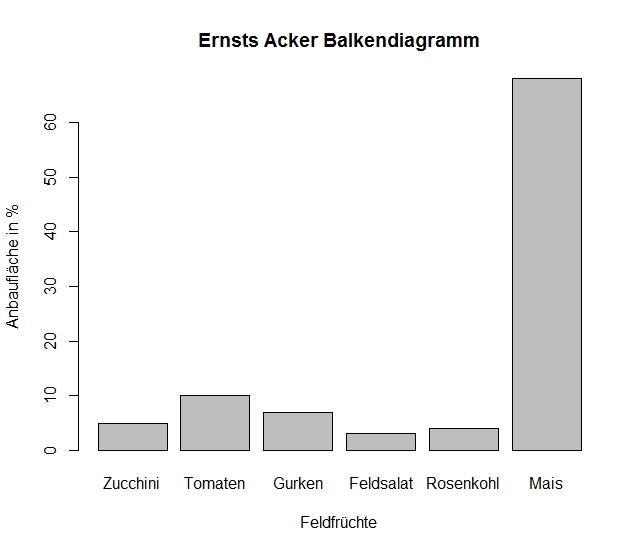
Bar Chart
A different possibility to display data is the bar chart. Generate it in R with the function barplot().
Generalized form:
barplot(H, xlab, ylab, main, names.arg, col)
- H Data vector
- xlab x axis label
- ylab y axis label
- main chart main label
- names.arg vector of bar labels
- col color(s)
Bar Example
Back to Ernst and his fields. Let's display his cultivation areas as percentage bars.
							> # Generate data
							>
							> H <- c(5, 10, 7, 3, 4, 68)
							> M <- c("Zucchini", "Tomaten", "Gurken", "Feldsalat", "Rosenkohl", "Mais")
							>
							> # labelling the chart
							> png(file = "Ernsts_Acker_Balkendiagramm.png")
							>
							> # generate the chart
							>
							> barplot(H,names.arg = M,xlab = "Feldfruechte", ylab = "Anbauflaeche in %",
								col = "gray", main = "Ernsts Acker Balkendiagramm", border = "black")
							> # save the graphics file
							> dev.off()
Bar Example
Histogram
A Histogram is a chart that displays the distribution of a variable. The simples way to get an overview of a distribution of variables is to visualize them before doing any calculations. To get a histogram we use hist() in R.Histogram
Generalized form:
hist(v,main,xlab,xlim,ylim,breaks,col,border)
mit
- v: numerical data vector
- main: histogram label
- xlab x axis label
- ylab y axis label
- xlim: x axis limits
- ylim: y axis limits
- breaks: width of the bars
- col: color(s)
- border: color of the bars' borders
Histoxample
To create a histogram we'll first simulate some data. We'll use 1000 random values from a normal distribution.Like this:
> x <- rnorm(1000)
> hist(x)
Histoxample
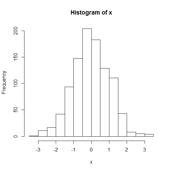
We didn't specify a filename and type, so the graphics should just be displayed on-screen.
Histoxample
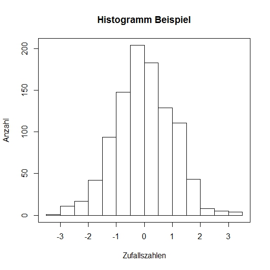
We'll add labels to the chart and its axes. And draw a border around the histogram.
							# a labelled histogram from random data
							> hist(x, main = "Histogram Example", xlab = "Zufallszahlen", ylab = "Anzahl")

							# and finally a box around it:
							> box()
Histoxample
Histoxample
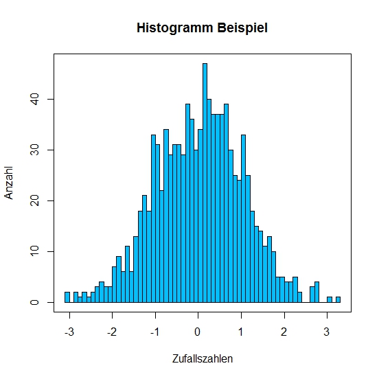
To further prettify the histogram we'll define the bar colors with col. We can also define the separation intervals on the x axis with breaks. With breaks = 50 we define that the x axis will have 50 intervals.
							# The Code:
							> hist(x, main = "Histogram example", xlab = "Some random",
								ylab = "number", col = "deepskyblue", breaks = 50)
							> box()
Histoxample
Line Plot
In R you can also display data as simple line plots. We use the function plot() for this.In the generalized form:
plot(v,type,col,xlab,ylab)we can choose plotting points type = "p", lines type = "l" or both type = "o".
Example:
							> linie <- c(27:7)
							> plot(linie, type = "o", col = "deepskyblue", xlab = "x", ylab = "y")
Scatterplot
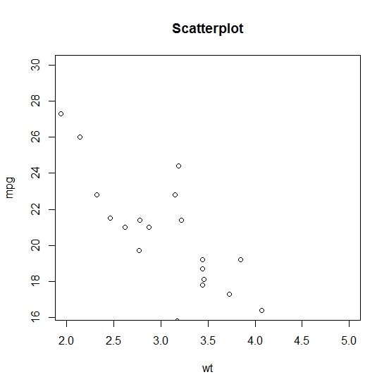
A scatterplot can also be created with the function plot(). The generalized form is:plot(x, y, main, xlab, ylab, xlim, ylim, axes)Our example will be the exercise dataframe "mtcars", already available in R.
							>?mtcars
							mtcars {datasets}	R Documentation
							Motor Trend Car Road Tests
							Description
							...
							Format
							A data frame with 32 observations on 11 variables.
							[, 1] 	mpg 	Miles/(US) gallon
							[, 2] 	cyl 	Number of cylinders
							[, 3] 	disp 	Displacement (cu.in.)
							[, 4] 	hp 	Gross horsepower
							...
Scatterplot mtcars
We'll compare "mpg" (fuel consumption) to "wt" (weight).
							# create a dataframe
							> input <- mtcars[, c(1,6)]

							> head(input)
											   mpg    wt
							Mazda RX4         21.0 2.620
							Mazda RX4 Wag     21.0 2.875
							Datsun 710        22.8 2.320
							Hornet 4 Drive    21.4 3.215
							Hornet Sportabout 18.7 3.440
							Valiant           18.1 3.460

							# Naming the plot file
							> png(file = "scatterplot_mtcars.png")
Scatterplot mtcars
							# Plotting mpg and wt for all cars with a weight between
							# 2 and 5 and mpg from 16.4 to 30

							> plot(x = input$wt, y = input$mpg, main = "Scatterplot",
								xlab = "wt", ylab = "mpg", xlim = c(2, 5), ylim = c(16.4, 30))
Scatterplot mtcars
Other Methods in Descriptive Statistics
Numerical summary of data:- Central tendencies: mean, median, modus
- quantile
- scatter
Central Tendencies
Mean:
Arithmetic mean is also called average.
It's calculated as the sum of the values divided by their number.
Central Tendencies
- The arithmetic mean weights all of the numbers equally, so it's susceptible to the occurrence of outliers.
- It's useful for the description of symmetrical distributions.
- A variant of arithmetic mean ist the trimmed mean. The most extrem values (e.g. 10% highest and lowest) are not used.
- In R you calculate it with mean().
Arithmetic Mean
							# Create a vector
							> x <- c(10, 100, 234, 65, 77, 34, 88, 98, 504, 1)

							# calculate the mean
							> mean(x)
							[1] 121.1

							# skip highest and lowest 10% of values
							> mean(x, trim = 0.1)
							[1] 88.25
Arithmetic Mean
Zur Kontrolle:
							# sort() will, well, sort the vector
							> y <- sort(x)

							# skip highest and lowest value
							# (first and last after sorting)

							> mean(y[2:9])
							[1] 88.25
Arithmetic Mean
For missing values we can use the option na.rm = TRUE.
							# create a vector with some missing data in it
							> x <- c(10, 100, 234, NA, 65, 77, 34, 88, 98, 504, 1, NA)

							# mean() will thus result in:
							> mean(x)
							[1] NA

							# Now we allow it to skip missing data:
							> mean(x, na.rm = TRUE)
							[1] 121.1
Median
To calculate the median we first have to sort the data by size.
The median is the value that…- …is exactly in the middle of the data, or…
- …precisely the value that has half of the values larger and half of the values smaller than itself.
Median
In R we calculate the median with median().
							# Let's have another vector, shall we?
							> x <- c(10, 100, 234, 65, 77, 34, 88, 98, 504, 1)
							# And a median, if you please.
							> median(x)
							[1] 82.5
Modus
The modus ist the value that is most abundant in a distribution. There is no ready-made function in R to calculate it.But you can use the function table to find out.
							> table(round(runif(100)*10))
							 0  1  2  3  4  5  6  7  8  9 10
							 4 13  9 10  7 14  9  8 12  6  8
							 # so, modus is 5 here.
Description of a Dataset
To understand how data are distributed (variance) we first have to check how different the datapoints are from the mean.
Variance
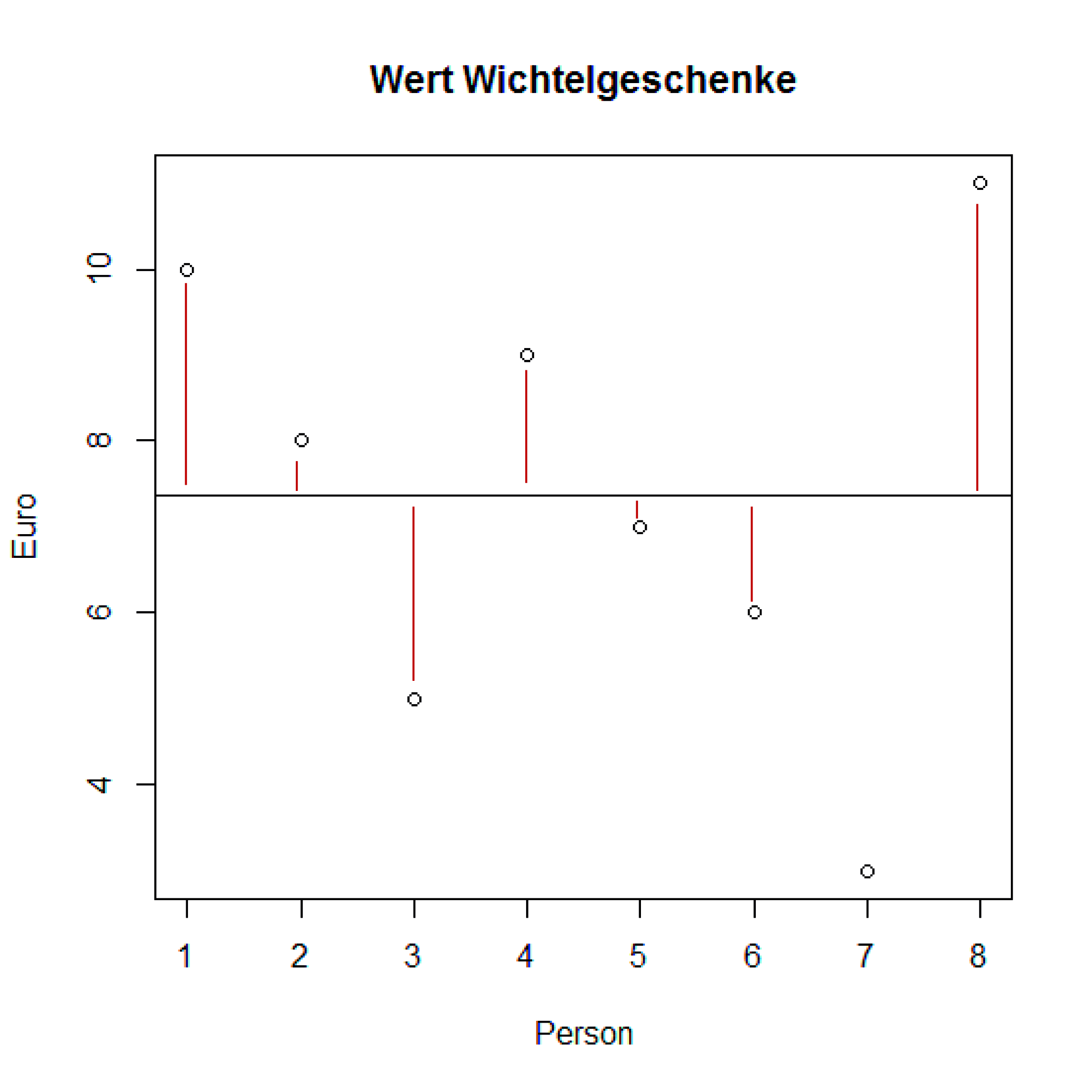
In the following example 8 persons have bought "Wichtel"-presents for their colleagues. It was decided that the presents should be worth 5 to 10 €. The following vector holds the different prices:
> wert <- c(10, 8, 5, 9, 7, 6, 3, 11)
First let's look at the highest and lowest values:
								> range(wert)
								[1]  3 11
People spent between 3 and 11 €. Values are heavily influenced by outliers.
Variance
How much was spent per average?
							# Average is calculated with mean().

							> mean(wert)
							[1] 7.375
We are interested in the amount the values differ from the mean.
							> diffs <- wert - mean(wert)
							> diffs
							[1]  2.625  0.625 -2.375  1.625 -0.375 -1.375 -4.375  3.625
Variance
Variance
Variance is a function of the sum of the differences squared, divided by the number of degrees of freedom.
						# Create the function
						# (Your first own function!)
						> variance <- function(x)sum(((x-mean(x))^2))/(length(x)-1)

						# Call the function
						> variance(wert)
						[1] 7.125
						# Because the difference from the mean can be positive
						# or negative we'd use the square of the sums
						> var(wert)
						[1] 7.125
Standard Deviation
Variance has the disadvantage that units are squared. €2 in this case. To get the standard deviation (sd, s) instead, we use sqrt() on the variance.In R you can just use the function sd().
						# The standard deviation from the presents' value is:

						> sd(wert)
						[1] 2.66927
						#  Or by using sqrt() as a control:
						> sqrt(var(wert))
						[1] 2.66927
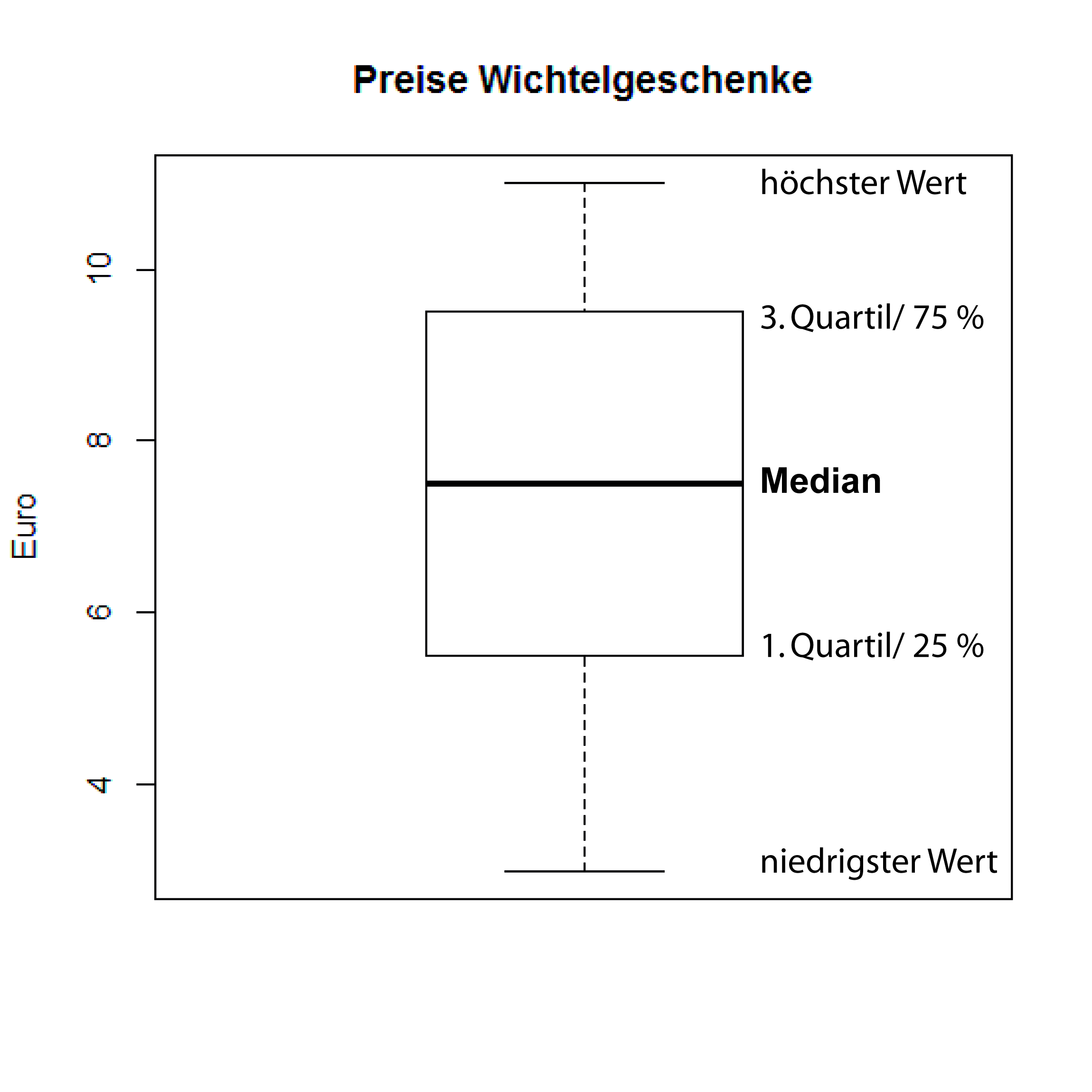
Box and Whisker Plot
							> boxplot(wert, ylab = "Euro",
								main = "Wichtel prices")
Normaldistribution and Student's t-Distribution
According to the "Central Limiting Value Theorem" ("Zentraler Grenzwertsatz") the means of a large number of random unrelated samples are ± normally distributed.
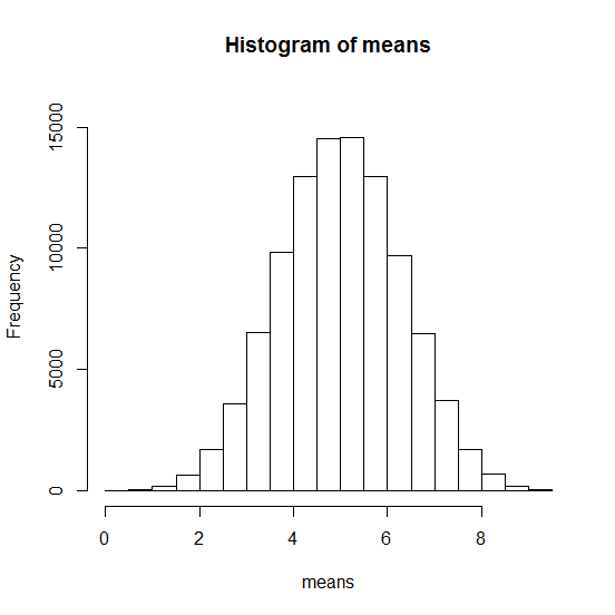
Simulating Normaldistribution
Let's draw five random numbers between 1 and 10 100.000 times. Then we calculate the average.
									#  Plotting average of random numbers

									> means <- numeric(100000)
									> for (i in 1:100000){
									    means[i]<-mean(runif(5)*10)
									  }
									> hist(means, ylim = c(0, 16000))
									# mean and sd of 100000 averages
									> mean(means)
									[1] 5.0026
									> sd(means)
									[1] 1.291312
Normaldistribution simulated
Normaldistribution
These values will be used with the density function of the normal distribution and plotted:
dnorm(x, mean, sd) # allgemeine Form
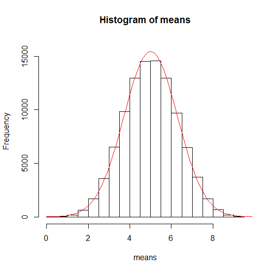
- x: Vector of values
- mean: average of sampled values
- sd: Standard deviation of means
Normaldistribution
					# We generate a sequence of numbers between 0 and 10
					# incrementing by 0.1 on the x axis
					> xwerte <- seq(0, 10, 0.1)

					# mean and sd for the density distribution on y
					> ywerte <- dnorm(xwerte, mean = 5.0026, sd = 1.291312) * 50000 #scaling
					> lines(xwerte, ywerte, col = "red", type="l")
Normaldistribution versus Student's t-Distribution
With very small sample sizes (n < 30) we need Student's t-Distribution instead of the Normal distribution.
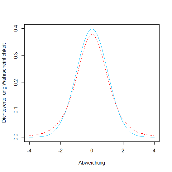
									# Comparison of Normal and Student's t
									# t-Distribution for a sample with 5 degrees of freedom
									# (1) Normal distrib. in blue

									> xwerte <- seq(-4, 4, 0.1)
									> ywerte <- dnorm(xwerte)
									> plot(xwerte, ywerte, type = "l", lty = 1,
										col = "deepskyblue", xlab = "Abweichung",
										ylab = "Densitydistrib. Probability")

									# t-Distribution with 5 degrees of freedom
									# (2) in red and dashed

									> ywerte <- dt(xwerte, df=5)
									> lines(xwerte, ywerte, type = "l", lty = 2, col = "red")
Normaldistribution versus Student's t-Distribution
Deductive Statistics
- Used for prediction of data and description of probabilities
- Deducing the properties of a population from a random sample.
- Includes hypotheses tests and regression models
Predictions from Normaldistribution
68% of the data will end up within ± one standard deviation of the mean.
						# We use pnorm() to calculate how much of the data
						# are smaller than mean-1 sd.

						> pnorm(-1)
						[1] 0.1586553

						> 1-pnorm(1)
						[1] 0.1586553
Predictions from Normaldistribution
If we want to know within ± which standard deviation with normally distributed data we will find 95% of our data we define a confidence interval with qnorm()
							> qnorm(c(0.025, 0.975))
							[1] -1.959964  1.959964
Predictions from Normaldistribution

95% of all our data are in the range of the mean ±1.96 standard deviations given normal distribtion!
Predictions from Normaldistribution
How to predict the probability that a value…- is smaller than a given other value
- is larger
- or exactly between two values?
Predictions from Normaldistribution
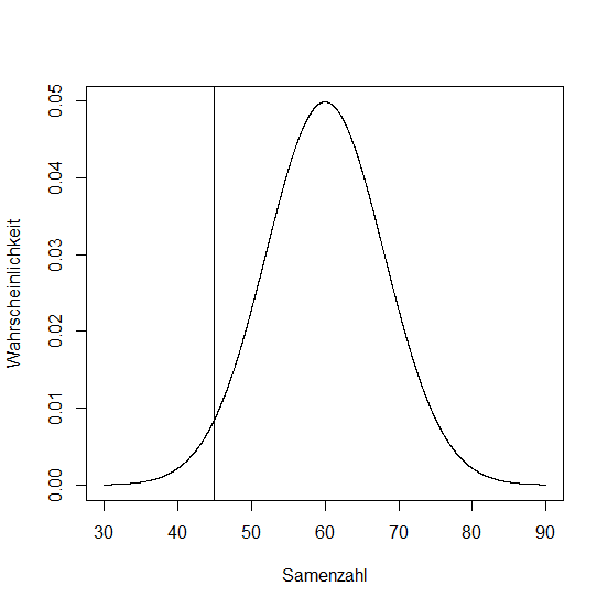
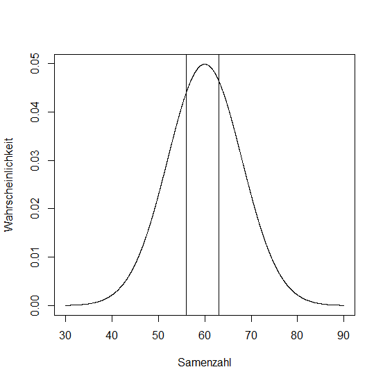
In 600 siliques of Boechera divaricarpa the amount of ripe seeds have been counted. The average was 60, standard deviation was 8.
							#  plotting a normal distrib.
							seeds <- seq(30, 90, 0.1)
							plot(seeds, dnorm(seeds, 60, 8), type = "l",
								xlab = "seeds", ylab = "probability")
Z Score
- xi: data value
- x̄: mean
- s: standard deviation
What is the probability that an arbitrary silique holds 45 seeds?
Calculating the z-Score:
									> z <- (45-60)/8
									> z
									[1] -1.875
Z Score
Z Score
What is the probability that a silique contains between 56 and 63 seeds?
							> z1 <- (56-60)/8
							> z2 <- (63-60)/8
							> z1
							[1] -0.5
							> z2
							[1] 0.375
Now, we subtract the lower probability from the higher one:
							> pnorm(0.375)-pnorm(-0.5)
							[1] 0.3376322
Probability is almost 34%!
Z Score
Testing Hypotheses
General Method:
- You postulate two hypotheses on a given question:
Null hypothesis H0 and Alternative hypothesis H1. - The hypotheses are formulated in such a way that you want to prove the Null hypothesis wrong, e.g. "The average values of these samples do not differ significantly."
- You have to define a level of significance a. Usually a = 5 % is chosen.
Testing Hypotheses
Wrong statistical decisions
- Error of the first kind or α-error: Null hypothesis is rejected erroneously though it is actually true.
- Error of the second kind or β-error: Null hypothesis is erroneously accepted, though it is actually false.
Comparing Two Samples
A bouquet of frequently used statistical methods:
- Comparing variances: Fisher's F-test (var.test())
- Comparing average values (implies normal distribution and equal variances): t-Test (t.test())
- Testing independence in contigency tables: Chi-Square Test (chisq.test()) or exact Fisher's Test (fisher.test())
- ANOVA and Post-Hoc-Analysis (aov(), TukeyHSD())
Fishers F-test
As an example we generate a dataset from the number of well-developed seeds per silique in two different
Boechera divaricarpa plants:
							# Let's read in the dataset from a file on the web.

							> samen <- read.table('https://ephedra.cos.uni-heidelberg.de/presentations/open/R-Frontiers/downloads/Samen.txt', header=T)
							> attach(samen) # ...to search path, optionally
							> names(samen)
							[1] "Pflanze1" "Pflanze2"

							# See the variances
							> var(Pflanze1)
							[1] 68.44444
							> var(Pflanze2)
							[1] 84.88889
Fishers F-test
							> var.test(Pflanze1, Pflanze2)

						        F test to compare two variances

							data:  Pflanze1 and Pflanze2
							F = 0.80628, num df = 9, denom df = 9, p-value = 0.7536
							alternative hypothesis: true ratio of variances is not equal to 1
							95 percent confidence interval:
							 0.2002692 3.2460895
							sample estimates:
							ratio of variances
							         0.8062827
							# Null hypothesis is accepted. Variances are equal.
I.e. these data may be compared with a t-Test!
t-Test
Question: Are the average values of two independent samples different?
Formula for the t-Test:
The t-Test refers to the standard error (SEM, standard error of the mean):
t-Test
As an example we test if the average values of seed creation in plant 1 and plant 2 are different.
Let's first graphically check the data with a "Box and Whiskers Plot":
							> boxplot(samen[,1], samen[,2], data = samen,  xlab = "Pflanzen",
								ylab = "entwickelte Samen", col = c("blue", "red"),
								names = c("Pflanze1", "Pflanze2"), main = "Boechera divaricarpa")
t-Test
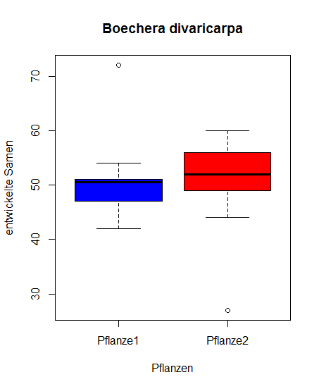
t-Test
In R you calculate the t-Test with the function t.test()
Generalized form:
								t.test(x, ...) # x=vector of numerical data

								t.test(x, y = NULL, alternative = c("two.sided", "less", "greater"),
							       mu = 0, paired = FALSE, var.equal = FALSE,
							       conf.level = 0.95, ...)
- x: vector of numerical data
- y: vector of numerical data
- mu: Difference between mean values when accepting the null hypothesis
- var.equal: indicates if variances are assumed equal. On TRUE variances will be pooled, on FALSE (default) the Welch approximation is used to estimate degrees of freedom.
- paired: independent samples
t-Test
In this example we use the following:
								# two-sided t-Test for two independent samples with equal variance
								> t.test(samen[,1], samen[,2], alternative = c("two.sided"), mu = 0,
									paired = FALSE, var.equal = TRUE, conf.level = 0.95)

								        Two Sample t-test

								data:  samen[, 1] and samen[, 2]
								t = 0.25538, df = 18, p-value = 0.8013
								alternative hypothesis: true difference in means is not equal to 0
								95 percent confidence interval:
								 -7.226749  9.226749
								sample estimates:
								mean of x mean of y
								       51        50
The Null hypothesis is accepted here, ther's no significant difference in mean values
								# Fuehrt zu demselben Resultat
								> t.test(samen[,1], samen[,2], var.equal = TRUE)
t-Test
Another example
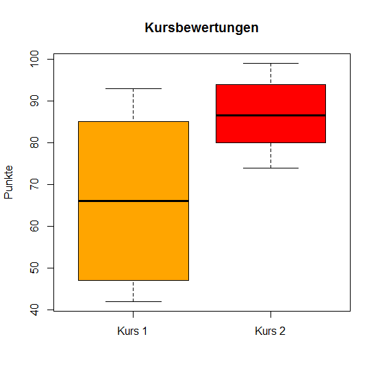
Two R courses with 10 students each are scored with points. Vector x is the points distribution for course a, vector y for course b.
								> x <- c(45, 57, 42, 85, 47, 90, 75, 82, 93, 50)
								> y <- c(85, 88, 77, 95, 99, 80, 74, 93, 82, 94)
t-Test
							# Testing variances
							> var.test(x, y)

							        F test to compare two variances

							data:  x and y
							F = 5.8028, num df = 9, denom df = 9, p-value = 0.01518
							alternative hypothesis: true ratio of variances is not equal to 1
							95 percent confidence interval:
							  1.441344 23.362213
							sample estimates:
							ratio of variances
							          5.802843

							# Box and Whiskers Plot

							> boxplot(x, y, ylab = "Punkte", names = c("Kurs 1", "Kurs 2"),
								col = c("orange", "red"), main = "Kursbewertungen")
t-Test
Welch t-Test
Welch's t-Test assumes two normally distributed populations with unequal variances and uses the hypothesis that they have equal mean values.
							# Welch t-Test using standard parameters
							> t.test(x, y)

							        Welch Two Sample t-test

							data:  x and y
							t = -2.8897, df = 12.012, p-value = 0.01357
							alternative hypothesis: true difference in means is not equal to 0
							95 percent confidence interval:
							 -35.25367  -4.94633
							sample estimates:
							mean of x mean of y
							     66.6      86.7
Wilcoxon Rank Test
- non-parametrical test (i.e. not based on distributions)
- can be used if there's no normal distribution
- not presented here…
Chi-Square Test
Used to compare two distributions or abundances.
$$ \chi^2 = \sum\frac{(\text{observed abundance} - \text{expected abundance})^2}{\text{expected abundance}} $$Chi-Square Test
Chi-square tests are often used in the context of genetics.
Let's for example ask if an antibiotics resistance segregates in a Mendelian way in two Arabidopsis mutant lines.
Chi-Square Test
In an Arabidopsis line we counted 263 resistant seedlings and 93 sensitive ones. The ratio to be expected according to Mendel would be 3:1 (resistant:sensitive).
							# Generating a matrix:

							> colnames = c("observed", "expected")
							> rownames = c("resistant", "sensitive")
							> genetik <- matrix(c(263, 93, 267, 89), byrow = FALSE,
								nrow = 2, dimnames = list(rownames, colnames))

							> genetik
							            observed  expected
							resistent        263      267
							sensitiv          93       89

							> chi <- ((263-267)^2/267)+((93-89)^2/89)

							> chi
							[1] 0.2397004
Chi-Square Test
We need a critical value to compare against. To look up the critical value for the Chi-square distribution we need the number of degrees of freedom (here it's 1) and the α-level (here: p = 0.95)
							# Look up critical value
							> qchisq(0.95, 1)
							[1] 3.841459
Important: If the statistically derived value is higher than the critical value, the null hypothesis is rejected!
Chi-Square Test
							# Now let's make R do it...
							> count <- matrix(c(263, 93), nrow = 2)
							> count
							     [,1]
							[1,]  263
							[2,]   93

							> chisq.test(count, p = c(3/4, 1/4))

							 Chi-squared test for given probabilities

							data:  count
							X-squared = 0.2397, df = 1, p-value = 0.6244
Linear Regression
- Statistical method to describe an observed dependent variable by one or more independent variables
- Based on two metric values: an influencing value and a target value
- y as target value
- x as influencing value
- a, b as coefficients
The generalized mathematical form is: y = ax + b
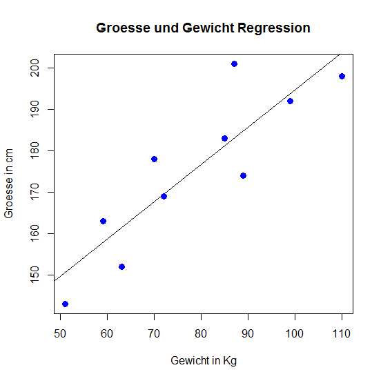
Linear Regression
For the regression we call the R function lm().
As an example we compare a function of ten individuals.
							# Let's create vectors with size and weight
							> size <- c(143, 152, 163, 198, 201, 174, 178, 169, 183, 192)
							> weight <- c(51, 63, 59, 110, 87, 89, 70, 72, 85, 99)

							#  Visualization
							> plot(weight, size, col = "blue",
								main = "Size and weight regression",
								abline(lm(size ~ weight)),cex = 1.3,
								pch = 16,xlab = "weight in Kg",ylab = "size in cm")
Linear Regression
Lineare Regression
							# lm() will output the coefficients (a, b)
							> lm(size ~ weight)

							Call:
							lm(formula = size ~ weight)

							Coefficients:
							(Intercept)       weight
							   104.5534       0.9012
It's the aim of the method to minimize (the squares of) the deviations.
ANOVA
"Analysis of Variance", can be used for hypothesis testing when more than two groups are involved.
It is similar to t-Tests (testing averages) with multiple combinations.
$$ H_{0} : \mu_{1} = \mu_{2} = ... =\mu_{n} $$ $$ H_{A} : \text{means are not all equal} $$ANOVA
Anova is usually conducted on a given model, in most cases a linear regression (lm()) is used.
							# Let's load some sample data:
							> pg<-read.table('https://ephedra.cos.uni-heidelberg.de/presentations/open/R-Frontiers/downloads/pg.txt', header=T)
							> head(pg)
							  weight group
							1   4.17  ctrl
							2   5.58  ctrl
							3   5.18  ctrl
							...
Dry weights of plant individuals were measured after different treatments. There are three groups in the dataset: a control group plus two different treatments.
ANOVA
ANOVA in R can be done by nesting the linear regression inside the aov() function.
						> pgaov <- aov(lm(weight ~ group, data = pg))

						> summary(pgaov)
						            Df Sum Sq Mean Sq F value Pr(>F)
						group        2  3.766  1.8832   4.846 0.0159 *
						Residuals   27 10.492  0.3886
						---
						Signif. codes:  0 ‘***’ 0.001 ‘**’ 0.01 ‘*’ 0.05 ‘.’ 0.1 ‘ ’ 1
The "one star" rating tells us that there are quite significant differences between the means of the groups.
Tukey's Test
A "post-hoc" analysis. After e.g. an ANOVA-Analysis, Post-Hoc-Analyses will give more information about the distinct groups.
It is a modified t-Test comparing the means of all groups, i.e. treatments in the analysis.
Tukey's Test
						> pgtk <- TukeyHSD(pgaov)
						> pgtk
						  Tukey multiple comparisons of means
						    95% family-wise confidence level

						Fit: aov(formula = lm(weight ~ group, data = pg))

						$group
						            diff        lwr       upr     p adj
						trt1-ctrl -0.371 -1.0622161 0.3202161 0.3908711
						trt2-ctrl  0.494 -0.1972161 1.1852161 0.1979960
						trt2-trt1  0.865  0.1737839 1.5562161 0.0120064

						>plot(pgtk)
- diff Difference in means
- lwr, upr Confidence intervall
- p adj Adjusted p-value
Tukey's Test
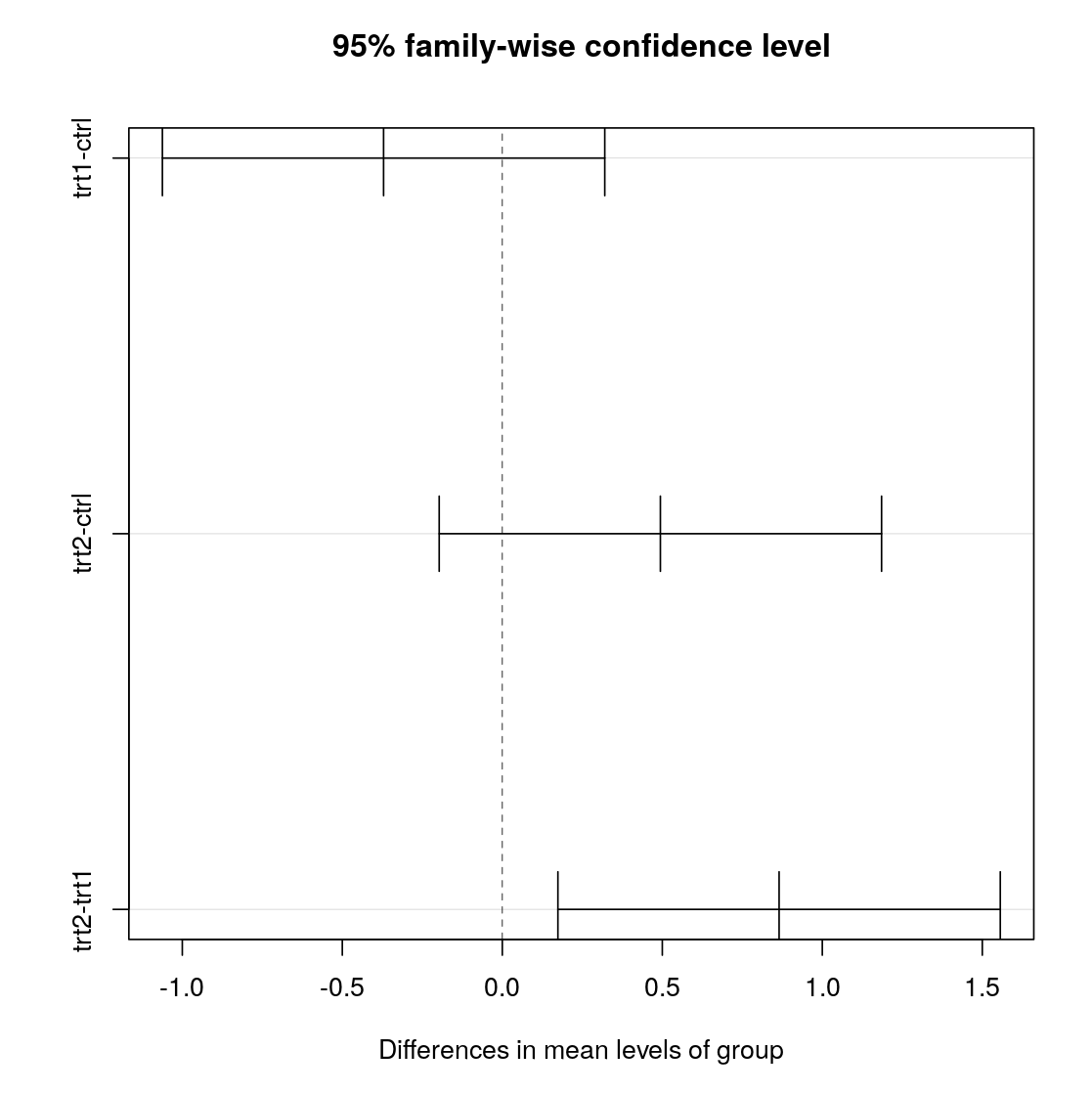
Groups trt1-ctrl and trt2-ctrl incorporate 0 in the confidence interval.
Only trt1/2 have a p-value suggesting significance.
						               p adj
						trt1-ctrl  0.3908711
						trt2-ctrl  0.1979960
						trt2-trt1  0.0120064
Honestly Significant Difference
HSD.test() from package agricolae provides another way of performing Tukey's test. With a little more verbose output.
					> HSD.test(pgaov, trt = 'group')
					...
					## $groups
					##    trt means  M
					## 1 trt2 5.526  a
					## 2 ctrl 5.032  ab
					## 3 trt1 4.661   b

					# same letter means not significantly different.
Exercises
Exercises for Visualization
Exercise 1
Generate a scatterplot of the values of log(1) to log(100) on the x-axis against the numbers from 1 to 100 on the y-axis.
Exercise 2
Use a histogram to show the distribution of the petal lenghts of the species "setosa" of the Iris dataset.
Exercise 3
Use a box and whiskers plot to show the lenght of the petals of the two species "setosa" and "virginica".
Exercise 4
Plot the mean values of the lengths of length of petals of "setosa" and of "virginica" using a barplot (barplot()). Add the standard deviations of the means of the petal length as error bars.
To do so you will need the function barplot2() of the package gplots. Install and load gplots and check the help for the function barplot2().Excercises concerning distributions and hypothesis tests
Exercise 1
Test if the mean values of the petal length of "setosa" and "virginica" are significantly different.
Exercise 2
Based on the Iris dataset we would like to ask if the sepal width is significantly higher in thespecies "virginica" as compared to "setosa". To be on the safe side we test vice versa if the sepal width of "virginica" is significantly smaller as comared to "setosa".
Perform the test statistics and visualize the differences grafically.
Exercise 3
In the laboratory you are checking mutant Arabidopsis lines with a defect during seed development. By opening the siliques you have counted all seeds that developed normally (norm), as well the the onces that show abort (abort). Of these lines 4 siliques each of 3 plants have been counted and the data were safed in the file seedabort.txt. Read in the data into R and inspect them. Analyse if the underlying defect is gamtophytic or zygotic. In case of a gametophytic defect you expect the ratio of norm : abort to be 1 : 1. In case of a sporophytic effect you expect the ratio to be 3 : 1. Please test both possibilities using an appropriate test statistics.
Exercise concerning linear regression
Exercise 1
Here we use an example dataset from wikibooks.org.
We generate the dataset using the following syntax:
						> x <- c(1, 3, 6, 11, 12, 15, 19, 23, 28, 33, 35, 39, 47, 60, 66, 73)
						> y <- c(3180, 2960, 3220, 3270, 3350, 3410, 3700, 3830, 4090, 4310, 4360, 4520, 4650, 5310, 5490, 5540)
						> bsp5 <- data.frame(x,y)
						> colnames(bsp5) <- c("Lebenstag", "Gewicht")
Create a Scatterplot containing a regression line.
Exercises concerning distributions
Exercise 1a
Randomly draw five numbers between 1 and 6 for 1000 times and calculate the mean values. Draw a histogram of the mean values.
Exercise 1b
Calculate the mean value of the mean and the standard deviation.
Exercise 1c
Plot the normal distribution in the same graph as the histogram.
Exercise 2
Plot the curve for the t-distribution with 4 degrees of freedom in the limits between ± 5 degrees of freedom. Mark the intervall containing 95 % of all values.